
FlowMelon
Webflow Development Agency
hello@flowmelon.com
FlowMelon logo
Book a Call
Book a Call

A Two-Sided UGC Marketplace With Two Very Different Pitches

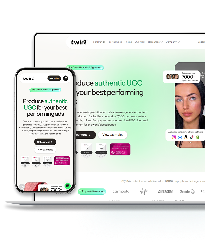
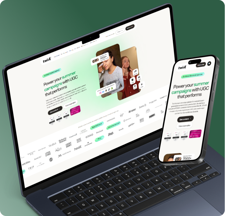
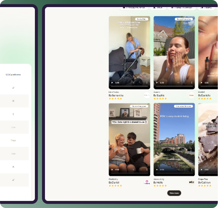
Twirl connects brands and agencies with a network of vetted creators to produce user-generated video and images at speed. That means one platform selling to two audiences with opposite priorities — marketers who need volume and performance, creators who need steady paid work. We built a site that speaks to each without confusing either

Total Funding

$X raised

Engagement increase

X%

Traffic Increase

X%

View Live Site

overview

Supply and Demand, Sold Separately

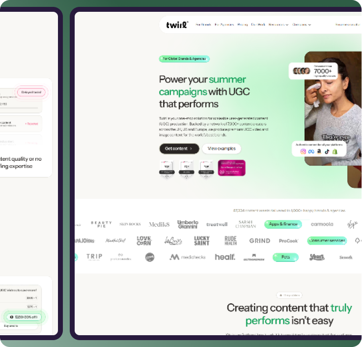
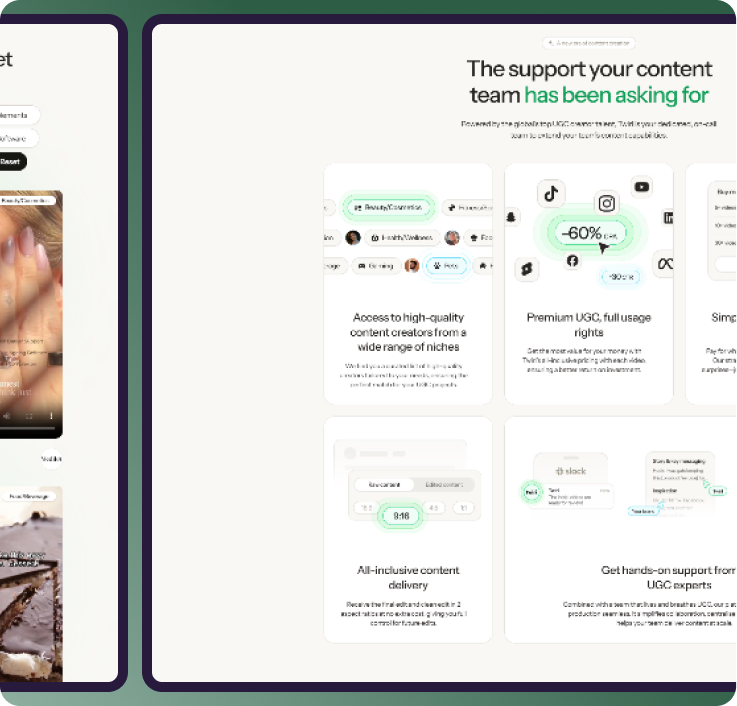
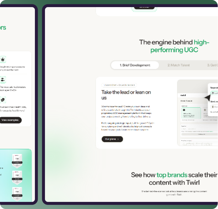
We split the site into distinct brand and creator journeys from the first click, each with its own value proposition, proof, and signup path — while keeping one coherent identity across both. Customer testimonials citing real performance results carry the brand side. Transparent earnings, industry range, and a plain explanation of how jobs work carry the creator side. Both funnel into the platform app with minimal friction.

Marketplaces need balance: brands want fast, native-style, test-ready content; creators want easy briefs and reliable $90–$300+ payouts. A single homepage trying to pitch both ends up pitching neither.

UGC & Creative Production Platform

B2B

Global

Results

Separate conversion journeys for brands vs creators.

Testimonials as primary proof for brands.

Self-serve creator signup with clear pay ranges.

No items found.

Project goals for traffic increase

Grow Both Sides Without Cannibalizing Either

Twirl's goal is to rethink how creative production works, which requires simultaneous growth in creator supply and brand demand. The site needed to acquire both audiences efficiently, communicate a genuinely differentiated model — vetted creators, complex multi-variation briefs, non-expiring credits — and hand users cleanly to the platform app without losing them at the seam between marketing site and product.

Technical specifications

Dual-path information architecture with separate brand and creator funnels sharing a single design system, so both journeys stay on-brand while the messaging diverges completely.

Seamless handoff to the Twirl platform app, with signup and login states passed through so users move from marketing site to product without repeating steps.

Component-driven build supporting rapid iteration on positioning, pricing, and social proof — a requirement for a fast-moving platform in a category that reshapes itself quarterly.

Before & After

Recent Case Studies

2.5x Engagement Increase

Enterprise

We rebuilt the site around outcomes rather than mechanics. Instead of leading with what the tool builds,the architecture leads with what teams are trying to achieve — drive adoption, launch products, grow advocacy — and routes product managers, growth leads, and customer success teams into the proof most relevant to their mandate. Named customer results carry the argument, and the platform's multi-channel reach is made explicit rather than buried in a features list.

2.5x Engagement Increase

Enterprise

We built the site around the parent's real question: will this raise my child's grades without adding stress? The weekly rhythm is shown rather than described, so the model becomes intuitive at a glance. Pricing from £16 per lesson and a 7-day free trial sit prominently, removing the two objections that kill EdTech signups. Exam board coverage across AQA, Edexcel, and OCR is stated plainly, because it's a hard filter for UK parents.

2.5x Engagement Increase

Enterprise

We split the site into distinct brand and creator journeys from the first click, each with its own value proposition, proof, and signup path — while keeping one coherent identity across both. Customer testimonials citing real performance results carry the brand side. Transparent earnings, industry range, and a plain explanation of how jobs work carry the creator side. Both funnel into the platform app with minimal friction.

2.5x Engagement Increase

Enterprise

We built the site as a booking tool. The narrative earns belief in the first scroll, social proof from event organizers and executives does the convincing, and a single booking path stays present throughout. Speaking topics are framed by the outcome an organizer is buying, not by Neno's biography, so a conference planner can match him to their program in seconds.

2.5x Engagement Increase

Enterprise

We designed a portfolio-first experience: a single brand promise up front, then clear paths into each venue so couples can compare settings, seasons, and capacities without leaving the site. Photography leads — because this is a decision made with the eyes — and every path terminates in the same action: book a tour. Rentals are surfaced as a natural addon rather than a separate business, which is exactly how Willowshore wants couples to encounter it.

2.5x Engagement Increase

Enterprise

We restructured the site into three clear pillars — Insurance Operations, Technology Services, and AI — each with its own entry point, proof, and conversion path. Long-form authority content (white papers, webinars, industry insights) was pulled out of a buried resources tab and repositioned as a lead engine. The result reads less like a vendor brochure and more like what OIP actually is: an operating partner that lets insurers grow without growing headcount.

Recent Case Studies

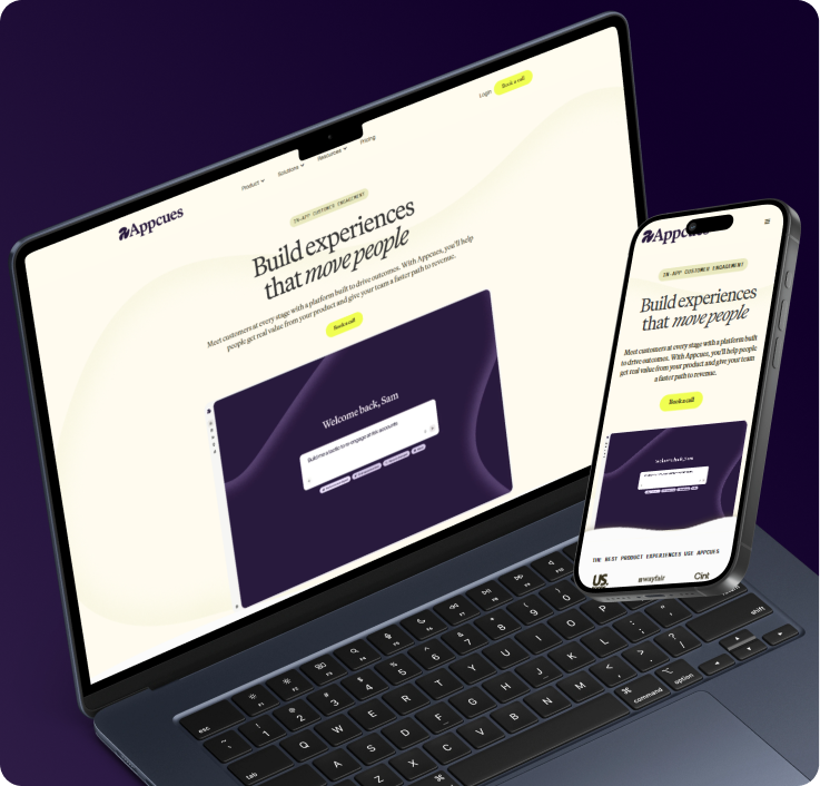
Appcues — B2B SaaS

Appcues helped invent the product adoption category in 2013 and has guided billions of in-app experiences for teams at Lyft, Segment, and Plural sight. But the product had grown well past the no-code tour builder people knew it as — into an AI-powered engagement platform spanning in-app, push, and email. The site needed to catch up with what the product had become.

Read Full Case Study

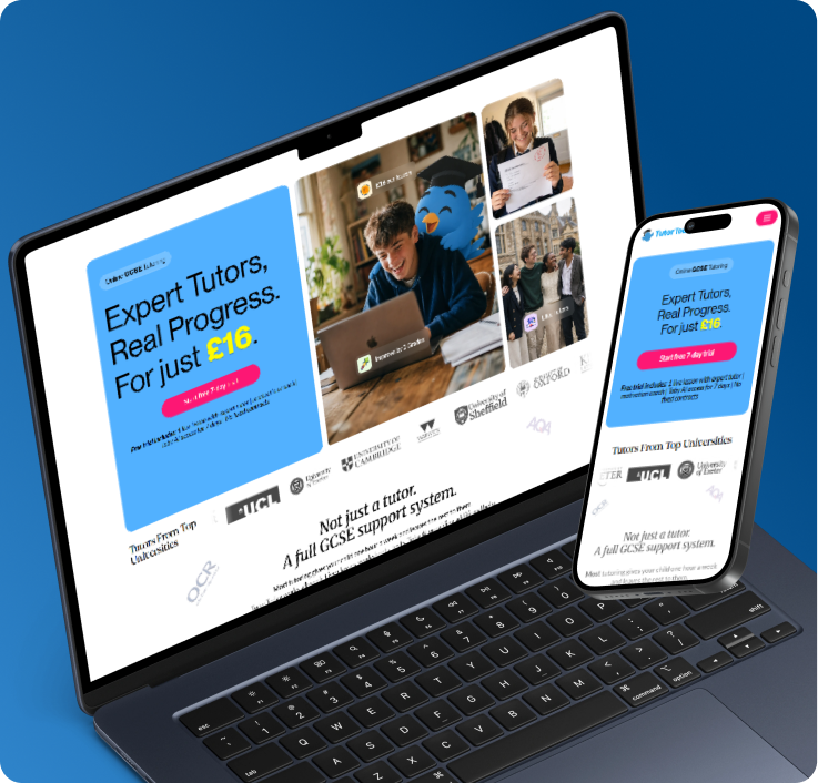
TutorToday — B2C

Parents comparing tutors at midnight don't read, they scan and decide. We made TutorToday's micro-class model instantly clear, put transparent pricing and a free trial where they couldn't be missed, and removed every reason to click away. The website now does the selling before anyone picks up the phone.


Read Full Case Study

Have project in mind?
Let’s talk

Agencies & Brands We've Partnered With
Book a call scheduling page with date and time picker